Pull out your phone right now. Open your business website. Try to book a service, fill out a form, or find your phone number using only your thumb.
How did that feel? If the answer is anything other than “effortless,” you have a problem.
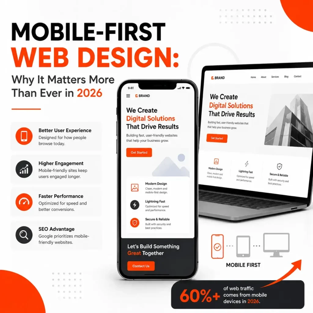
Mobile traffic has crossed 60%. Google uses mobile-first indexing. In 2026, mobile-first design isn’t a trend — it’s the foundation.
What Mobile-First Actually Means
Mobile-first means starting the design process with the smallest screen and expanding for larger screens. This is the opposite of traditional responsive design.
Mobile-first forces prioritization. What’s the one message? The one action? This clarity improves the desktop experience too.
How Mobile-First Design Impacts Google Rankings
Google predominantly uses the mobile version of your site for ranking. Key factors: Core Web Vitals on mobile, mobile usability errors in Search Console, and page load time on mobile networks.
A site scoring 90 on desktop but 45 on mobile is failing the test that matters most.
The Business Impact of Poor Mobile Experience
Higher bounce rates — mobile bounce rates on poorly optimized sites routinely exceed 70%.
Lost conversions — difficult forms, tiny buttons, and complex checkouts create barriers.
Damaged brand perception — a clunky mobile experience raises doubts about professionalism.
Key Principles of Mobile-First Design
Thumb-zone navigation — primary elements in the center and bottom of screen.
Generous tap targets — at least 48 pixels tall with adequate spacing.
Simplified content hierarchy — lead with the most important message.
Performance-first development — compress images, minimize JavaScript, aim for LCP under 2.5 seconds.
Touch-friendly forms — correct input types, auto-fill support, minimal fields.
Mobile-First for Different Business Types
Local services: Click-to-call buttons, map integration, visible business hours.
eCommerce: Streamlined browsing, easy filtering, simplified checkout with digital wallets.
Professional services: Credibility elements that display well on mobile, scheduling links.
Restaurants: Mobile-readable menus (not PDFs), prominent ordering buttons.
The Competitive Advantage
Most competitors still aren’t doing mobile well. A mobile-first website that loads fast and converts smoothly stands out dramatically.
Book a free mobile audit and we’ll show you exactly what your visitors experience on their phones.
Frequently Asked Questions
What’s the difference between mobile-friendly and mobile-first?
Mobile-friendly is designed for desktop first then adjusted. Mobile-first is designed for mobile from the start then enhanced. The user experience difference is significant.
Does mobile-first design cost more?
Not necessarily — it’s a methodology, not an add-on. Retrofitting an existing desktop-first site may require a redesign. For new projects, mobile-first is standard.
Will mobile-first design make my desktop site worse?
No. The constraint of designing for mobile first forces better prioritization, which actually improves the desktop experience.